Choosing the Best Platter Material for Visual Impact
Selecting the right material for a serving platter is the foundational step in culinary presentation. Each surface offers distinct light-reflective properties and textures that can either elevate or detract from the food. Marble, for instance, provides a cool, heavy backdrop that communicates luxury, while natural slate offers a dark, matte finish that makes vibrant vegetables and cheeses pop with intensity. The weight and opacity of the material also influence the perceived value of the meal; a heavy stone platter suggests substance, whereas thin, translucent porcelain suggests delicacy and refinement.
| Material | Visual Impact | Best For |
|---|---|---|
| Porcelain | Clean, classic, and high-contrast | Formal multi-course dinners |
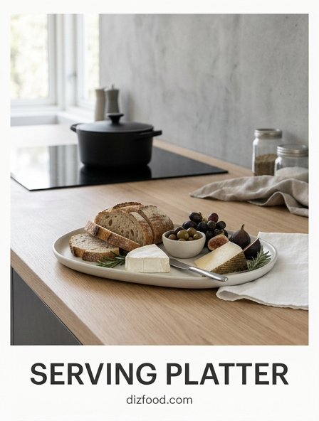
| Natural Wood | Rustic, warm, and organic | Artisanal breads and charcuterie |
| Slate | Modern, dramatic, and dark | Brightly colored appetizers |
| Polished Metal | High-shine and industrial | Chilled seafood and modern desserts |
When selecting materials, consider the ambient lighting of the kitchen or dining area. Glossy surfaces may cause harsh glares under bright overhead lights, while matte finishes like ceramic or wood absorb light to create a softer focus on the ingredients.
Principles of Color Contrast and Platter Selection
Color theory is a vital tool for any host or chef. The platter serves as a canvas, and the colors of the food must be considered in relation to the vessel's hue to create a harmonious or striking visual. Complementary colors, which sit opposite each other on the color wheel, generate the most energy. For example, a deep blue ceramic platter provides a stunning background for orange-hued foods like roasted carrots or salmon.
- Monochromatic: Using shades of the same color for a minimalist, sophisticated look.
- High Contrast: Placing light-colored foods on dark slate or dark sauces on white porcelain.
- Analogous: Selecting platter colors that share similar undertones with the food for a calming effect.
- Neutral Balancing: Utilizing grey, beige, or off-white to allow multi-colored salads to shine.
Avoiding a "washed out" appearance is critical. Serving mashed potatoes or white fish on a plain white platter can make the dish look unappetizing and flat. In these instances, choosing a platter with a bold rim color or a textured dark finish provides the necessary definition to distinguish the food from its container.
Mastering Scale and Proportion in Food Arrangement
The relationship between the size of the serving platter and the volume of food is a key element of professional plating. A platter that is too small looks cluttered and messy, making it difficult for guests to serve themselves without causing a spill. Conversely, a platter that is too large can make a generous portion look meager and unfulfilling. The goal is to achieve a balanced ratio where the food feels substantial but is framed by a clear border of the platter's surface.
Proportion also applies to the individual items placed on the dish. If serving a variety of hors d'oeuvres, they should be relatively uniform in size to maintain a sense of order. When placing a large protein, such as a roast, the accompanying vegetables should be sized so they do not overwhelm the main attraction. Professionals often follow the "two-thirds rule," where the food occupies approximately two-thirds of the available surface area, leaving the remaining third as a visual frame. This ensures the arrangement feels intentional rather than accidental, guiding the eye toward the center of the display.
The Art of Creating Height and Dimension
Flat presentations often lack the visual excitement necessary for a memorable meal. To overcome this, culinary experts use height to create a three-dimensional landscape on the platter. This can be achieved by layering ingredients or using secondary vessels to lift components off the primary surface. By varying the levels, you create a dynamic scene that invites the viewer to explore the different textures and colors of the dish.
- Vertical Stacking: Lean tall proteins against starches or vegetables to draw the eye upward.
- Nested Vessels: Use small ramekins or dipping bowls placed directly on the platter to add structural variety.
- Mounded Bases: Create a foundation using grains, purees, or leafy greens to elevate the main ingredients.
- Structural Garnishes: Utilize tall herbs or crisp shards of crackers to add the final peak to a dish.
Adding dimension also serves a functional purpose, as it prevents different components from bleeding into one another. For instance, keeping a sauce in a raised bowl prevents it from making a nearby crusty bread soggy, preserving both the visual integrity and the intended texture of the meal.
Strategic Garnish Placement for Professional Results
Garnishing is the final touch that signals a dish is complete and ready for service. However, a common mistake is over-garnishing or placing items randomly across the platter. Professional results require a strategic approach where the garnish serves to highlight the main ingredients rather than obscure them. Every garnish should be edible and relevant to the flavor profile of the dish, acting as a functional hint of what the diner is about to experience.
Placement should follow the natural flow of the food. If the items are arranged in a linear fashion, a light sprinkling of herbs along that line can reinforce the geometry. If the arrangement is circular, a central garnish can act as a focal point. Using microgreens, edible flowers, or a precision drizzle of infused oil can add pops of color that draw attention to specific textures. It is important to avoid the "rim garnish" style of the past; modern presentation keeps the garnish within the boundaries of the food or just slightly overlapping, ensuring the platter's edges remain clean and the overall look stays contemporary and focused.
Balancing Negative Space on Large Serving Dishes
Negative space, or the empty area of the platter not covered by food, is just as important as the food itself. In minimalist plating, negative space is used to create a sense of elegance and focus. On a large serving dish, leaving generous margins allows the eye to rest and prevents the presentation from feeling overwhelming. This concept, often referred to in Japanese aesthetics as "Ma," emphasizes that the space between objects gives those objects their shape and importance.
When working with large platters, avoid the temptation to fill every corner. Instead, group the food into a central "island" or an asymmetrical "sweep." An off-center arrangement can look modern and artistic, provided the weight of the food is balanced by the sheer openness of the remaining surface. This technique is particularly effective with colorful or intricately decorated food, as the surrounding empty space prevents the visual details from becoming lost in a sea of items. Clean, polished margins signify a high level of hygiene and care, suggesting that the food was placed with precision and intention by a skilled hand.
Maintaining Optimal Food Temperatures on Different Surfaces
The thermal properties of a serving platter are critical for ensuring that hot food stays warm and cold food remains refreshing during a gathering. Different materials have varying levels of thermal mass and conductivity, which dictates how they interact with the food's temperature. Choosing the wrong surface can lead to a steak cooling too quickly or a cheese selection sweating and losing its structural integrity.
| Material | Thermal Property | Temperature Strategy |
|---|---|---|
| Cast Iron | High heat retention | Pre-heat in oven for hot appetizers |
| Marble | Naturally cold | Chill in fridge for pastry or seafood |
| Stoneware | Moderate retention | Warm before serving roasts or stews |
| Glass | Low retention | Best for room-temperature items |
To maximize effectiveness, always "temper" your platter. Run a ceramic dish under hot water or place it in a low-temperature oven before adding hot food. Conversely, place slate or metal platters in the freezer for twenty minutes before serving sushi or chilled fruits. These small steps ensure the culinary experience remains consistent from the first bite to the last.
Arranging Communal Platters for Maximum Appeal
Communal platters, such as charcuterie boards or mezze spreads, require a balance between abundance and accessibility. The goal is to make the platter look bountiful while ensuring that guests can easily pick up individual items without disturbing the rest of the arrangement. A well-organized communal platter should have a logical flow, often starting with larger anchor items and filling the gaps with smaller, bite-sized components.
- Anchor Points: Place large cheeses, bowls of dip, or bunches of grapes first to establish the layout.
- Flowing Lines: Arrange crackers or sliced meats in curves or "rivers" to guide the eye across the board.
- Clustering: Group related flavors together, such as placing dried fruits near the soft cheeses they pair with.
- Accessibility: Ensure that pre-sliced items are fanned out so guests do not have to touch multiple pieces.
By filling in small gaps with nuts, berries, or sprigs of herbs, you create a "bounty" effect that is visually stimulating. Avoid leaving large patches of the platter visible in communal settings, as a sparse board can look picked over and uninviting to late-arriving guests.
Using Texture to Enhance Culinary Presentation
Texture adds a sophisticated layer to culinary presentation that goes beyond simple color and shape. This involves the physical surface of the platter as well as the textural contrast of the food placed upon it. A smooth, glossy white porcelain plate provides a sharp contrast to the rough, craggy exterior of artisanal bread or the flaky layers of a puff pastry. Using texture effectively can create a sensory experience that begins before the first bite is even taken.
In modern kitchen design, matte-finished platters are increasingly popular because they provide a non-reflective surface that emphasizes the moistness of sauces or the shine of a glaze. Combining different textures on one platter-such as a velvety pea puree next to a crunchy seared scallop-creates visual interest through the way light interacts with the surfaces. Even the rim of the platter can contribute; a hammered metal edge or a ribbed ceramic border adds a tactile element that frames the dish. When the texture of the vessel complements the texture of the food, it creates a cohesive and professionally curated look that elevates the entire dining experience.
Caring for Fine Ceramic and Natural Wood Serveware
Investing in high-quality serving platters requires a commitment to proper maintenance to ensure they remain safe and beautiful for years. Different materials require specific cleaning and storage protocols. Fine ceramics and natural wood are particularly sensitive to temperature shocks and harsh chemicals. Understanding these needs prevents warping, cracking, and the loss of protective finishes that keep your serveware food-safe.
- Wood Care: Never soak in water; wipe with a damp cloth and treat monthly with food-grade mineral oil.
- Ceramic Care: Avoid moving a dish directly from a cold refrigerator to a hot oven to prevent thermal shock.
- Slate Care: Hand wash only and occasionally rub with a drop of olive oil to maintain its deep black luster.
- Storage: Use felt liners or napkins between stacked platters to prevent scratching the glazed surfaces.
Hand-washing is almost always preferred for high-end serveware, as dishwasher detergents contain abrasives that can dull the finish of porcelain and strip the natural oils from wood. By taking these precautions, you preserve the integrity of the material, ensuring that your platters continue to provide a stunning backdrop for your kitchen creations without the risk of degradation.

Comments