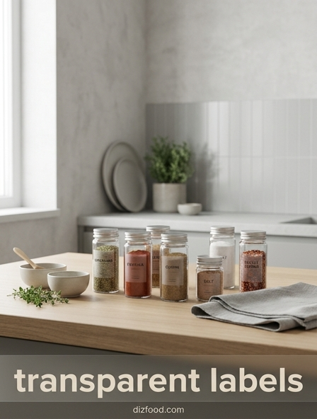
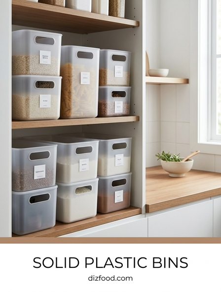
The Benefits of Transparent Labels for Pantry Organization
Implementing transparent labels within your pantry offers a transformative approach to kitchen management. Unlike opaque stickers or messy handwriting, clear decals provide a professional finish that allows the natural textures and colors of your ingredients to shine through. This visual clarity reduces the mental load of searching for specific items, as the contents remain the primary focus while the text provides essential confirmation. By standardizing the look of your storage, you create an environment where every item has a dedicated place, drastically reducing the likelihood of clutter accumulating over time.
- Enhances immediate recognition of staple ingredients like flour, sugar, and grains.
- Creates a sense of order that encourages users to maintain the system long-term.
- Eliminates the "mystery jar" phenomenon often found in deep cabinets.
- Supports a faster workflow for busy families and avid home bakers.
Ultimately, these labels bridge the gap between functionality and style. When your pantry is organized with such precision, the space becomes more than just a storage area; it becomes a curated gallery of your culinary supplies, making daily kitchen tasks significantly more enjoyable and efficient.
Achieving a Minimalist Modern Aesthetic in Your Kitchen
The minimalist modern kitchen thrives on the concept of "less is more," emphasizing clean lines and the removal of visual noise. Transparent labels are a cornerstone of this design philosophy. Traditional branded packaging is often loud, featuring clashing colors and aggressive marketing that disrupts the serenity of a modern home. By decanting goods into uniform glass jars and applying sleek, transparent labels, you strip away the chaos of commercial advertising and replace it with a cohesive, high-end look that feels intentional and calm.
To achieve this aesthetic, focus on monochromatic schemes and simple fonts. The goal is for the labeling to disappear into the glass, leaving only the essential information visible. This approach works exceptionally well in open shelving layouts where the pantry contents are part of the room's overall decor. When every container shares a identical labeling style, the eye moves smoothly across the space without being jarred by inconsistencies. This creates a sophisticated atmosphere that mirrors the professional kitchens of world-class chefs, where efficiency and beauty coexist in perfect harmony.
Maximum Visibility Strategies for Stored Dry Goods
Strategic visibility is about more than just seeing what is inside a container; it is about optimizing the way light and placement interact with your storage system. Transparent labels should be positioned at the same height across all jars to create a horizontal line that the eye can follow naturally. This alignment is crucial for deep shelves where items in the back might otherwise be obscured. Furthermore, using clear labels on glass allows light to pass through the container, highlighting the quantity remaining and the quality of the product.
- Place labels at eye level for frequently used items like coffee or cereal.
- Use larger font sizes for bulk containers stored on higher or lower shelves.
- Ensure labels are applied to the smoothest surface of the jar to prevent bubbling.
- Utilize tiered "stadium" shelving to ensure back-row labels remain visible.
By following these strategies, you maximize the utility of your clear storage. The ability to scan an entire shelf in seconds and immediately identify every grain, nut, and spice ensures that no ingredient is forgotten or left to expire in a dark corner.
Choosing the Right Typography for Clear Pantry Decals
The typography you select for your transparent labels dictates the overall "vibe" of your kitchen while serving as the primary tool for readability. When choosing a font, you must balance character with clarity. Scripts can add a touch of farmhouse warmth, while sans-serif fonts lean into a more industrial or contemporary feel. The table below outlines common typographic choices for kitchen organization and their intended impact on the space's design language.
| Font Style | Aesthetic Impact | Best Use Case |
|---|---|---|
| Sans-Serif | Modern, Clean, Sharp | Minimalist kitchens and spice jars |
| Serif | Classic, Elegant, Timeless | Traditional pantries and glass canisters |
| Script/Handwritten | Whimsical, Cozy, Personal | Farmhouse styles and cookie jars |
Regardless of the style, ensure the stroke weight is thick enough to be legible against the color of the food inside. Dark text works best for light-colored goods like rice, while white text is ideal for dark ingredients like black beans or cocoa powder.
How Transparent Labeling Streamlines Meal Preparation
Efficiency in the kitchen is often a matter of seconds. When you are in the middle of a complex recipe, searching for a specific spice or grain can break your rhythm and lead to mistakes. Transparent labeling streamlines this process by providing an instant index of your inventory. Instead of lifting and turning multiple jars to read their sides, a well-labeled system allows you to identify ingredients from a distance. This is particularly helpful when dealing with similar-looking white powders, such as baking soda, cornstarch, and powdered sugar.
- Reduces the time spent searching for niche ingredients during cooking.
- Helps other family members find items without needing to ask for assistance.
- Facilitates a "mise en place" workflow by making ingredient gathering effortless.
- Minimizes the risk of using the wrong ingredient due to visual confusion.
When your pantry functions like a well-oiled machine, meal preparation becomes a smoother, more creative endeavor. You can focus on the flavors and techniques of your dish rather than the logistics of finding your supplies, leading to a more relaxing culinary experience.
Best Container Pairings for a Cohesive Visual Style
Transparent labels are only as effective as the containers they occupy. To achieve a professional, cohesive look, it is essential to pair your decals with high-quality vessels that complement their clarity. Glass remains the gold standard for pantry storage because it does not stain, scratch, or retain odors over time. Borosilicate glass, in particular, offers a crystal-clear view that makes transparent labels look as though they are printed directly onto the surface. When selecting containers, consider the closure mechanism-bamboo lids offer a natural, organic feel, while stainless steel lids provide a sleek, modern touch.
Consistency in shape is another vital factor. Square or rectangular containers maximize shelf space by eliminating the gaps found between round jars, creating a "built-in" look. However, round apothecary-style jars are perfect for creating a focal point on countertops. By choosing a specific container line and sticking to it throughout the kitchen, the transparent labels act as the unifying thread, tying together different zones of the room into a single, intentional design statement that feels both luxurious and highly functional.
Transitioning to a Uniform Modern Pantry System
Moving from a traditional pantry filled with cardboard boxes to a uniform modern system requires a systematic approach. The transition begins with a complete audit of your current inventory, discarding expired items and grouping like-with-like. Once you have categorized your goods, you can determine the sizes of containers needed. Transparent labeling should be the final step in this process, applied only once the containers are filled. This ensures the labels are centered and level relative to the contents of each jar.
- Categorize items into groups: Grains, Baking, Snacks, and Spices.
- Select a uniform container set that fits your shelf dimensions perfectly.
- Decant all dry goods, discarding original packaging while noting expiration dates.
- Apply transparent labels at a consistent height across all vessels.
This transition might take an afternoon, but the results are permanent. A uniform system not only looks better but also changes how you shop and cook. You will find yourself buying in bulk more often and feeling a sense of pride every time you open your pantry doors to see a perfectly ordered collection.
The Impact of Clear Labels on Inventory Management
Effective inventory management is the secret to a low-waste kitchen. Transparent labels play a critical role here by making it impossible for items to "hide." When you can see exactly how much of a particular ingredient is left, you are less likely to overbuy or run out of essentials unexpectedly. This visual feedback loop is superior to digital apps or paper lists because it is passive; you see the status of your pantry every time you enter the kitchen. The following table illustrates how transparent labeling improves the inventory lifecycle.
| Inventory Stage | Standard Packaging Problems | Transparent Label Solution |
|---|---|---|
| Shopping Prep | Checking inside boxes for volume | Instant visual check of levels |
| Purchasing | Buying duplicates of hidden items | Clear knowledge of what is in stock |
| Usage | Using old items last (hidden in back) | Better visibility ensures rotation |
By maintaining a clear view of your supplies, you naturally adopt a "first-in, first-out" mentality. This reduces food waste, saves money on your grocery bills, and ensures that the ingredients you are using are always fresh and at their peak quality.
Sustainable Kitchen Habits Through Visual Organization
Sustainability and organization are deeply intertwined. One of the most significant environmental benefits of a labeled, clear-container system is the shift toward bulk shopping. When you have a beautiful, permanent container for oats or flour, you are more likely to visit the bulk section of the grocery store, eliminating the need for single-use plastic bags and boxes. Transparent labels make this lifestyle choice easier by giving those bulk purchases a "branded" feel, so they don't look like anonymous chores but rather like premium pantry staples.
- Encourages the use of reusable cloth bags for bulk shopping trips.
- Reduces reliance on processed foods that come in heavy plastic packaging.
- Makes it easier to see when bulk supplies are low, preventing emergency trips.
- Promotes a "refill" culture within the household, involving the whole family.
When you take pride in the visual organization of your kitchen, you become more mindful of what you bring into it. The labels serve as a reminder of your commitment to a more sustainable, intentional way of living, turning the act of organizing into a meaningful contribution to environmental health.
Final Touches for a Professional Chef Inspired Pantry
To truly elevate your pantry to a professional standard, the details matter. Beyond the primary transparent labels, consider adding discreet date stickers to the bottom or back of your containers. This keeps the front aesthetic clean while maintaining food safety standards. Another chef-inspired touch is the use of "category" labels for different zones of the pantry-such as "Baking Essentials" or "Breakfast Grains." This adds another layer of organization that helps guests or family members navigate the kitchen with ease.
Proper lighting is the final ingredient. Installing small LED puck lights or strip lighting inside your pantry can make your glass jars and transparent labels sparkle, enhancing that high-end, gallery-like feel. Ensure that your most-used items are placed within the "strike zone"-the area between your shoulders and knees-for maximum ergonomics. With these final touches, your kitchen transitions from a simple utility room into a masterfully organized workspace that inspires culinary creativity every single day. The clarity provided by your labeling system becomes the foundation of a home that is as beautiful as it is functional.

Comments